Friday, May 17, 2013
FinallyTHECLIPPING MASK!!!!!!!!!!!!!
To create a clipping mask get a bunch of pictures and put them in a patter. Next type something such as "class of 2015" and move the layer with the pictures above the type. Next right click and click on create clipping mask and you are done.
Monday, May 6, 2013
TapeAndCurl
The image at the very top is the original image and the second image is the curl afflicted image while the bottom image is the tape afflicted image. To get the curl effect you must use the rectangular marquee tool on the area you want to curl. Next use the gradient tool and use it diagonally on the rectangle you made. Afterwards go to transform then warp and drag the corner to make a curl effect. Finally add a drop shadow effect of a distance of 5 and size of 7 and spread of 0. To get the tape effect make a rectangle with the rectangular marquee tool. Then fill in the rectangle with the color D3A537 then select the brush tool. Select the color DCB965 and one of the new brushes you were supposed to download from the tutorial then simply click on the band-aid to give it an old tape effect. Then change the master diameter to 42 px and keep clicking on the ends of the tapes to give it an old tape effect then just copy the tape and make a new layer. Then carefully place the tape on the edges of the picture to make it look like it was taped and then add a drop shadow effect and change the distance to 1 the spread to 1 and size to 5 and the copy the layer style that was done on the tape and then paste it to the other tape layer. Lastly change the canvas size to width 500 and height to 370(pixels of course) That is how you make a tape and curl effect.
Monday, April 29, 2013
PerfumeThing
All the images above except for the last one are the images I used to create my master piece cologne ad. My idea behind this was that if I used animals it would reflect on the word "spirit" and myself with a sombrero would reflect on the word "life." Has for the black guy, he was simply there to create humor, because he is in a bamboo forest in China and you would not expect black men to be in China.
Wednesday, April 24, 2013
LETTHEREBECOLOR
To add a coloring effect to your boring life you must follow my wise steps to fulfill your life. Go to image>Adjustments>Desaturate, because I said so. Next, select the history brush and make it whatever size you need , but make sure the hardness is 100%. Now just paint over whatever you want to colorize and hip-hip-hooray! you are now done.
Highpass
The image on the top of the screen is the high pass added effect image. Begin by duplicating the background layer and change the blending mode of the duplicate to overlay. After that add a high pass and then change the blending mode layer of the duplicate to soft light or hard light, and if you feel the saturation is too much just change the opacity to 80%.
Sepia
To get the sepia color image you must follow these steps. Step 1: If your image is in color, go to image > adjustments > desaturate and then skip to step 3. Step 2: If the image is in gray scale, go to Image > Mode > RGB Color. Step 3: Go to image > adjust variations. Step 4: just move the slider down a little bit. Step 5: choose more yellow once and more red once. After these few and easy steps you now have a sepia color image.
Vignette
The image on the top is the new and modified image and the image on the bottom is the original image. Start with the elliptical marquee tool and draw an ellipse or circle on the area you want to focus on. then invert the selection and change the brightness so anything on the outside of the shape will turn darker. Then to darken it farther make a copy of the original layer and add a layer mask in which you will draw in with the brush tool (make sure you are using black as the foreground color.) Afterwards use the gradient tool and hit the circle selection to make a circle and change the layer mode to soft light or overlay and lastly change the opacity to 50%. Finally, if you really desire to add attraction to the center of the image or circle use the burn and dodge tools.
Thursday, April 18, 2013
Soft focus
I will begin this by stating that the top image is the original image and the bottom image is the soft focus shot. Began the soft focus shot by copying the layer using ctrl+J and the making a Gaussian blur effect. Change the opacity of the image and the blur radius until you get something you like. The whole point is to make you stand out and to do this you must change the saturation to your own liking , and that is it.
Tuesday, April 16, 2013
EyeMakeUp Tutorial
To start off make a new layer and change the blending mode to color. Then select some color and use the brush tool on the eyelid. Afterwards make a new layer and change the blending mode color. Then make a new layer and use a new color then color the upper eyelid and paint a new color. After that use the eyedropper tool to copy the color of the eyelashes and then make a new layer and change the blending mode to multiply and paint on the eyelashes.
Monday, April 15, 2013
Hair color
This is a way to get your hair dyed by using Photo Shop. First upload an image and switch to quick mask mode. Then using the brush tool color over the area you want to dye (notice the color is automatically a transparent red. After you are done "dying" your hair go to Select tab and click inverse and then go to adjustments and use the Hue/Saturation tab and that is it.
Friday, April 12, 2013
EyeMakeUp
Clearly the top image is the real image and the bottom image is the better image. Began by using the elliptical marque tool and make a circle around the eye but leave a bit of space. Then make a layer mask and make a Gaussian blur into the layer mask. Then delete the eyelid off of the mask by using the paintbrush tool with the color black. Lastly simply click on the new adjustment layer icon while holding down the Alt key and click on "Use previous layer to create clipping mask" then just change the color of then iris.
matrixchairthing
The top image is the original image and the bottom image is the matrix image. You should began by simply erasing away the chair and the using the polygonal lasso tool and clone some grass to put in the empty void where the chair was. After that's done use the polygonal lasso tool on a new layer so you can add a shadow effect under the man by going to stroke and put 4 pixels for the width use the color black and location would be inside. right after that use a Gaussian blur on the shadow and then if you want fix the grass by using the spot healing brush.
Thursday, April 11, 2013
Contentawarefill
I would like to begin by saying the original is the one on top and the one on the bottom is the new and improved version of it. All you must simply do is get rid of the giant pole and the small pole, because they are very distracting. First you must select the polygonal lasso tool and make a shape somewhat close to the borders of the objects you want to remove. after making a closed object around the item to be removed go to edit then fill and in the fill options select content aware and that is it.
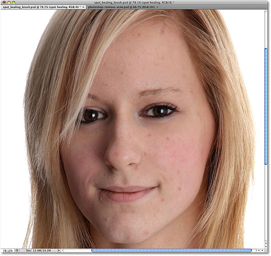
Wednesday, April 10, 2013
AcneandSpotHealing
This tutorial was to father increase the skills for the spot healing brush. Start by having an image then create a new blank layer and click on sample layers on the options and simply click on any pimples and change the lighten or darken mode to make areas darker or lighter.
BabyTruck_andPisaTower
This assignment was formed of two tutorials which featured the stamp tool. The first assignment was the baby bus which consisted of a few level adjustments a clone stamp, and a burn effect. The first step was to make the level adjustments and to do that simply change the box in the middle to 85 and the box on the right to 222. Now we create a clone stamp by using a brush of 50 pixels and 0% hardness then just press the alt key and right click to claim the source point. After that we select the source point options and change the opacity to 25% if not done already. We also change the height and width to 30% to symbolize a baby bus. Later we erase what ever we don't want on the truck such as empty white spaces. After doing so we add a burn effect to the baby truck with the burn tool. The next step is rather simple....simply add an exposure adjustment layer and set the values to...exposure...+0,20....offset....-0,0050......gamma correction.....0,75 and also add a gradient map and make both adjustment a linear burn to add elegance to the baby bus. Finally add a blur by going under filter then blur and then blur again. (hint: remember to keep the actual image and the "baby image" on separate layers before cloning)
Start by using a picture of the leaning tower of Pisa. Then swiftly add a levels adjustment of 0, then 1,35 and lastly 200. Afterwards create a new layer and name it straight tower. Now we go back to the original image layer and select a clone source near the tower. After selecting the clone source we select the clone source options and change the angle to 4. The we bring out a vertical guide line to show us what the tower should look like (straight.) After this switch back to the straight tower layer and began using the clone stamp tool; as you do this you may notice that the tower behind it is disappearing and that is exactly what we want. Lastly fix any mistake you might have made while making the tower.
Friday, March 22, 2013
Advertisement_for_LittleMexico
This is my ad for my taco company named "Little Mexico." My ad is mostly typography and humor that is intended for a teenage or adult audience. I used gray on the words that were not very important such as in "THE" because nobody cares about those simply words. In other words I used colors such as in "NEW" the word "new" usually stands for something good and I made it bigger and a different color simply to attract attention to it. The next part of the sentence I used the bottom part of the W to start it off as my A so it could say "AND." The next word uses periods to create suspense, but it is still not a very important word. Now the Tacos Machos is the main product being sold, and since the name has twelve letters I just simply used the three Mexican colors and divided by three so every four letters is a different color and that was to attract even more attention. The next sentence says "Simply because she like them." it is referring that the baby girl likes the Tacos Machos and that sounds convincing due to the fact that babies do not lie. The next sentence is in white to point out what company owns the Tacos Machos. The last few sentences in gray and smaller font are the listed "side effects" which are written in Spanish just to create some humor among Spanish speakers.
Last but not least is the baby effects. The baby was originally placed there to create a cuteness effect among females. The baby has a dodge tool effect on her arms and eyes to brighten up her skin and add even more cuteness. The baby was also added a burn tool effect to give her more shadows so she would look more fierce. There is also this "light" around the baby so the reader's attention can be directed towards the baby. The truly last element of this ad is the logo in the bottom right corner which is just there to say "This is the Little Mexico" company ad."
Baby Url:
Friday, March 8, 2013
"Bleeding Statue"
This is the outcome of all my hard work and even though it is not complete it is a master piece all by itself. The actual tutorial was hard to understand and I admit I couldn't work as fast as I should have so if I could do one thing over it would be ask more questions to my classmates.
Friday, February 22, 2013
Contrast Projecct
This is the Final image of my work.
This is the text tutorial:
This is the URL of the image:
The first thing I did was make a stamp copy of the background (Charlie in this case.) The I did a black vector mask and filled his eyes with white paint on about 25% opacity and changed the blend mode to screen. Later I made another stamp copy of layer 1 and desaturated the image and the changed the blend mode to hard light to sharpen charlie. I repeated that step except I made a high pass instead of desaturated and also made a black vector mask to make his facial hair look better. I made another stamped copy which had a blend mode of multiply and made a white vector mask so to fix his hair a little. After that I made another stamp copy and desaturated the image while also reducing brightness and increasing contrast;then I made a black vector mask so I could fix his facial hair yet again.(blend mode still hard light) I made another stamp copy but added a Gaussian blur effect and changed the blend mode to hard light.
As for the letters I made then in another document following the tutorial steps and then just simply trasnlated them to the charlie psd file.
Thursday, February 21, 2013
Grunge
For this assignment I made a grunge effect on the old man. As you can see the top picture is the original and the bottom picture is the more aggressive version of the old man after the grunge.
One of the things I did most was make a stamp copy of the old man several times which just saves time. I also made vector mask and used the high pass effect to add more sharpening to the old man. I also changed up the brightness just a bit to make him look like more of a threat. If I could change one thing about this at this moment it would be the beard color because it looks a little out of place to me.
Wednesday, February 20, 2013
WhiteGuyHighPass
The first thing I did was duplicate the layer and added a high pass to about 500 pixels. Later I changed the blend mode to hard light. Then I copied the new layer I made (the first copy) and then copied it again and changed the opacity to about 55%. Later I added a new layer and set it to hard light and filled it with 50% gray. The last few steps was adding 2% of noise with gaussian and monochromatic checked in and the last step was ti desaturate the image to about -26.
In conclusion this is a white guy who looks even better due to Photoshop.
Tuesday, February 19, 2013
Ipod
This beautiful work of art was made by an extremely brilliant mind. The brilliant mind took a picture of himself and filled himself with black color and gave himself an I pod for no reason at all. Then he added a green back ground using the paint bucket tool. Later he made a layer and placed it in front of the background layer and behind himself so he would have a fun, beautiful background.
Subscribe to:
Posts (Atom)